Thursday, December 15, 2016

Home Breadth 10 - Snow Queen (Alternate Design)

I really liked the design of my Snow Queen character, so I wanted to play around with her again, but in a different style and medium. I had been wanting to experiment with Sakura Gelly Roll pens on top of Prismacolors for a while now, so I decided to do that with this piece. 

In my original Snow Queen piece, I didn't have enough petals from the fake flower to make the skirt as full as I wanted. So for this design, I added multiple layers for a more full and regal effect. I also put her in a more playful pose and made her hands visible this time. 

I really like how the Gelly Roll pen made the lace detail on the skirt pop, but my favorite part is the texture I was able to create on the fur jacket. I've struggled with coloring fur with Prismacolors in the past, but I think I really succeeded with it this time. I overall really like the way this turned out. 


Sunday, December 11, 2016

Class Breadth 5 - When She Loved Me

I was inspired by the song "When She Loved Me" from Toy Story 2 for this piece. I wanted to explore the relationship between a girl and her teddy bear. The story of the piece is showing how technology took the place of the girl's teddy bear as her most important thing as she grew up. 

The new technique I decided to use was used to create the background. The direction of the background represents the winds of change to symbolize the change in the girl's interests. I was inspired by the technique Priscilla Schacht uses when she paints her galaxy watercolors. 


Tuesday, December 6, 2016

Home Breadth 9 - Textured Abstract

I haven't tried to do an abstract piece yet, so this idea popped into my head to use ripped pieces of masking tape to create a design. I allowed the tape to tear the way it wanted to, that way the result would be organic, jagged lines. I chose green as the color scheme because the organic nature of the torn tape made me think of leaves and other plants. 

I'd used Prismacolor on watercolor paper before, but not by itself. I really like the texture that's created when you put light pressure onto the paper while you're coloring due to the tooth of the paper. I think the result of this method of coloring produced an interesting result.

I enjoyed taking a break from drawing people, so I think I'd like to try more abstract pieces. 


Wednesday, November 30, 2016

Figurative Painting

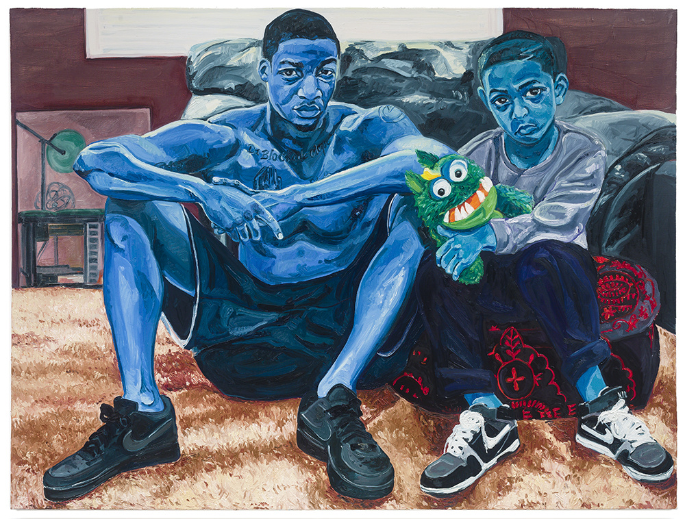
Out of all of the artists in the article, I was the most drawn to Jordan Casteel's work. I like that she creates her art through experiences from her own life and what she has witnessed. 

"I am most interested in sharing sensitive, humanistic, and honest stories of my community." - Jordan Casteel 


I like how detail oriented her work is and I can relate to that. The small details like the Nike swoosh on the boys' shoes and the tattoos on the older male's chest really caught my eye. I also really love the style this painting is done in. The figures are quite realistic, but their skin tone is very unnatural and I find this to be very intriguing. The blue skin tone and the expression on their faces gives this piece a somewhat upsetting vibe. The direct eye contact between the figures and the viewer also gives off a sense of disappointment. My favorite part of the piece is the little monster that the boy is holding. I love how Jordan captured the texture of the monster's fur as well as the texture of the carpet. 

I think I'd like to try her approach to painting. When painting with acrylics, I often try to get the colors as blended and smooth as I can. I like how Jordan allows for the brushstrokes to be visible and not completely blended, especially on the values of the skin. I think she has some really beautiful value work in this piece and I want to further play with my use of value and depth. 

Monday, November 21, 2016

Real Life and Fantasy Exhibit Reflection

How did you feel about the experience of curating a show?
I feel it was a successful show and I had a positive experience curating it. I certainly got a lot of experience with matting, which will be helpful when we do the school art show at the end of the year. 
 What were some struggles you experienced in the process? How were these dealt with?
It took me quite a while in the beginning to mat one piece, but I became faster and more efficient as I did it more and more. Other than that, I can't think of any other struggles. Though getting all the pieces organized and hung up took quite a long time, we all worked well together and I think that could be seen when looking at the final exhibit. 
 What were the most successful aspects of the process?
The process of choosing the pieces went smoothly and we didn't have trouble agreeing on things. I also feel that the design for the exhibit that Lydia and I worked together on worked well and was successful in making the most of the limited space within Domicile. 
 What would you do differently next time?
One thing I might do differently would be to separate the pieces into the various sections of the exhibit prior to getting all the pieces to the space. We could've started hanging pieces up sooner had we sorted the pieces into fantasy, real life, and pairings before we took everything over to Domicile. 
 What do the photos tell you?

This photo tells me that people were stopping to really look at the pieces instead of just briefly glancing and then moving on. They appear to be enjoying this particular wall. 


This photo tells me that, design wise, we had a clear concept and were able to execute it. I particularly liked this section of the exhibit because of the large ears from the fox and the cat and the pairing of the mermaid and the underwater scene because of the clown fish in each piece.


This photo tells me that having food and refreshments can really bring together an exhibit and make it more of a social experience. I was also very fond of the way Lydia designed the sign.

Tuesday, November 8, 2016

Home Breadth 8 - Troll Girl

My little troll girl enjoying the forest. The hair is made out of yarn. 


Thursday, October 27, 2016

Class Breadth 4 - Reflection

In my reflection piece, I chose to place three marbles on a mirror and use acrylic paint as my medium. 

The choice to have two orange marbles and one blue marble was intentional. Not only are blue and orange compliments, but I wanted to show that it's okay to be unique. The blue marble represents standing out in a crowd of those who are all the same. I also chose to to have the tabletop that the marbles are resting on be slightly tilted upwards in the direction of the blue marble to signify that I think you should highly view uniqueness as a positive thing. 

I also made the decision to alter the colors a bit by taking a picture of my still life using a filter on my phone. I just really liked how the filter made the colors pop. 


Sunday, October 23, 2016

Home Breadth 7 - My Most Beautiful Sister

I was inspired to make this piece after seeing the previews for Fox's remake of The Rocky Horror Picture Show. But I didn't want to depict the character designs from the remake, I wanted to use the original designs. 

My favorite characters from Rocky Horror are Riff Raff and Magenta. I wanted to show the strong sibling bond that they have. I particularly like the expression on Magenta's face. I think I captured the sass that Patrica Quinn brought to the character in the original movie. 

I also wanted to try something new with this piece. I usually don't like to outline my sketches before I color them because I like the look of that style. But I knew that I wanted to do this piece with watercolors, so I thought I'd experiment with the lined style. I really like how it turned out and I think it's a nice balance between hard and soft. 


~ Crayola Watercolors on Strathmore Watercolor Paper, lined with Micron Pens ~

Monday, October 17, 2016

AP Exhibit 2016


I related to this image by Zachary Gudziak because of the simplicity of it. I also really liked the message of the piece. It's an interesting interpretation on how greed affects humanity. I like the plain background. There are times when I use very plain backgrounds because I want the focus to be on my main subject. 


Hannah Jurgens, Osceola HS, Largo, FL — Digital art

I related to this image by Hannah Jurgens because I love that she embraced a style that is entirely her own. I've been trying really hard this last year to find my own drawing style and I've found it to be quite a challenge. My current style is not nearly as stylized and animated as Hannah's, but we are alike in the way that we aren't striving for realism. 

Wednesday, October 12, 2016

Thursday, October 6, 2016

Home Breadth 6 - Pumpkin

This girl is not any particular character. I just wanted to create a girl that was dressed in a pumpkin-inspired way. 


~ Prismacolor Colored Pencils on Strathmore Tan Toned Paper ~


Sunday, October 2, 2016

Home Breadth 5 - Strange and Unusual

In no way did I intend for this piece to come across as romantic. I just happen to really love Beetlejuice and Lydia as characters and I love these costumes. Something I really like is the way the shades of red play off each other. 


~ Prismacolor Colored Pencils on Strathmore Toned Gray Paper ~

Friday, September 23, 2016

Home Breadth 4 - Longing

For this week, I wanted to do a piece inspired by Corpse Bride. I chose to do a watercolor painting because I wanted the colors to be soft. 

I wanted Emily to be the focal point, so I made the choice to only show Victor's arm. I wanted to show a divide between the two. Victor is torn because he wants to be with someone like Emily, but his family and society feel otherwise. Because of this, Victor and Emily's hands are almost joined, but there is still a gap between them.

After I'd finished the piece and had looked at it for a while, I thought about what it meant from Emily's perspective. I chose to give Emily a welcoming expression because she certainly wants Victor to be with her and is open to the idea of loving someone again. But also, I feel leaving Victor completely out of it represents a fear of the unknown. The forest I chose for the background is the same forest that Emily was murdered in by her first "love." Though Emily appears to be very open and welcoming, I think she still has some fear of what would happen if she grew attached to another man. Another betrayal would be crippling for her to live, well, un-live with. 


~ Crayola Watercolors on Strathmore Watercolor Paper ~ 

Thursday, September 22, 2016

Class Breadth 2 - The Snow Queen

Using tin foil, wire, a motorcycle magazine, fake flowers, hot glue,and red sand, I decided to create my interpretation of a snow queen. I wanted to convey a strong and confident female figure. 


Cindy Sherman

I chose to research the self-portraiture of Cindy Sherman. She stood out to me in the video we watched because of her movie-like approach to self portraits. 

Upon further research, I found that Cindy is very unique to other approaches to self portraits that I've seen. Instead of always portraying her real self, she very much likes to dress up and become someone she's not. 


She's dressed up as women, men, clowns, famous celebrities like Marilyn Monroe, as well as using makeup to make herself look older than she is. I found it interesting that she tends not to wear makeup in her everyday life because she wears so much makeup when she is taking her photographs. Cindy said that when she was in college, "I was really ambivalent about it because I still liked it, but you did not wear make-up, you did not dye your hair, you didn't wear a bra – we were all natural. Don't shave or anything. In some of the really early work, you can see my hairy legs." I find that to be fascinating that she can take on such an alter ego in her portraits.

I also found it fascinating that she failed her first photography exam. It amazes me that people can build their craft so well over time to the point where they eventually become well-known. All of her portraits are photographs and she enjoys using her own face and body as her canvas. 

~ Article ~


Thursday, September 15, 2016

Home Breadth 3 - Felt Face

I wanted to try and sew fabric onto paper just to see how it would look. In this piece I used felt. I think the end product looks very Picasso-inspired. 


Tuesday, September 13, 2016

Display

I feel our display falls under Honorific because we we're trying to praise and bring attention to the comic art style. 

For our display, we chose to take inspiration from pop culture and comics. When creating our display and deciding how to fill the space, we chose to group each category of artifacts into their own little section of the display. We chose to use a variety of artifacts, ranging from posters to action figures. A point of cohesion within our display is the repeated use of thick, black lines. This is often used in the comic art style. 

Thursday, September 8, 2016

Home Breadth 2 - Endorable

Despite being an Ewok, Wicket listens to Leia better than her own son. 


~Prismacolor Colored Pencils on Strathmore Toned Gray Paper~ 

Tuesday, September 6, 2016

Home Breadth 1 - Butterflies

My inspiration for this piece came from a blog post I wrote last year. This was fully the result of my tendency to over-analyze the smallest of details in movies. 


~Koi Watercolors and Prismacolor Colored Pencils on Strathmore Watercolor Paper~

Friday, September 2, 2016

Class Breadth 1 - Waiting in the Wings

For my reconstruction breadth, I chose a framed image from a NPR calendar. I was drawn to this piece because, from my perspective, it looked like a mother and daughter. I was also drawn to it from the colors of the background. The background was the component I chose to keep from the original piece. 

Because of the colors of the background and the mother/daughter dynamic, I chose to take inspiration from a scene from The Hunger Games: Catching Fire of Katniss and Effie backstage before Katniss' big Quarter Quell interview. I greatly see Effie as a maternal figure for Katniss and so I chose to show that in my reconstructed piece. I am happy with how the piece turned out.  

Inspiration

Original Piece


Reconstructed Piece

Thursday, August 25, 2016

Fair Signs

Also at the Iowa State Fair, they had a variety of signs painted by local artists scattered around the fairgrounds. This year, they were statues that had the fair logo on the front. They had this same concept the last time I was at the fair, but they were painted pig statues. Personally, I liked the pigs better. My favorite sign was the second place winner. I liked the color scheme and the technique in which it was painted. It showcased many of the most popular fair attractions and I thought that was very creative. 


4-H

At the Iowa State Fair, they had a building housing pieces created by members of 4-H. These pieces were judged and ribbons were awarded to judge’s favorites. I saw a lot of creativity and talent when looking at these displays as well as a lot of variety. I liked that there were many different art mediums and techniques used as well. My favorite pieces were a wreath made of round ornaments and a four-piece, abstract wall hanging.