Thursday, October 27, 2016

Class Breadth 4 - Reflection

In my reflection piece, I chose to place three marbles on a mirror and use acrylic paint as my medium. 

The choice to have two orange marbles and one blue marble was intentional. Not only are blue and orange compliments, but I wanted to show that it's okay to be unique. The blue marble represents standing out in a crowd of those who are all the same. I also chose to to have the tabletop that the marbles are resting on be slightly tilted upwards in the direction of the blue marble to signify that I think you should highly view uniqueness as a positive thing. 

I also made the decision to alter the colors a bit by taking a picture of my still life using a filter on my phone. I just really liked how the filter made the colors pop. 


Sunday, October 23, 2016

Home Breadth 7 - My Most Beautiful Sister

I was inspired to make this piece after seeing the previews for Fox's remake of The Rocky Horror Picture Show. But I didn't want to depict the character designs from the remake, I wanted to use the original designs. 

My favorite characters from Rocky Horror are Riff Raff and Magenta. I wanted to show the strong sibling bond that they have. I particularly like the expression on Magenta's face. I think I captured the sass that Patrica Quinn brought to the character in the original movie. 

I also wanted to try something new with this piece. I usually don't like to outline my sketches before I color them because I like the look of that style. But I knew that I wanted to do this piece with watercolors, so I thought I'd experiment with the lined style. I really like how it turned out and I think it's a nice balance between hard and soft. 


~ Crayola Watercolors on Strathmore Watercolor Paper, lined with Micron Pens ~

Monday, October 17, 2016

AP Exhibit 2016


I related to this image by Zachary Gudziak because of the simplicity of it. I also really liked the message of the piece. It's an interesting interpretation on how greed affects humanity. I like the plain background. There are times when I use very plain backgrounds because I want the focus to be on my main subject. 


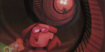
Hannah Jurgens, Osceola HS, Largo, FL — Digital art

I related to this image by Hannah Jurgens because I love that she embraced a style that is entirely her own. I've been trying really hard this last year to find my own drawing style and I've found it to be quite a challenge. My current style is not nearly as stylized and animated as Hannah's, but we are alike in the way that we aren't striving for realism. 

Wednesday, October 12, 2016

Thursday, October 6, 2016

Home Breadth 6 - Pumpkin

This girl is not any particular character. I just wanted to create a girl that was dressed in a pumpkin-inspired way. 


~ Prismacolor Colored Pencils on Strathmore Tan Toned Paper ~


Sunday, October 2, 2016

Home Breadth 5 - Strange and Unusual

In no way did I intend for this piece to come across as romantic. I just happen to really love Beetlejuice and Lydia as characters and I love these costumes. Something I really like is the way the shades of red play off each other. 


~ Prismacolor Colored Pencils on Strathmore Toned Gray Paper ~